

Screen Size Map - Alternatives & Competitors
Compare viewport sizes for responsive design planning
Screen Size Map is an AI-powered tool that compares viewport sizes in device-independent pixels to help designers and developers plan responsive layouts for websites and digital products, with data visualization based on worldwide screen usage statistics.

Ranked by Relevance
-
1
 Pixefy Streamline and Perfect Responsive Web Design Testing
Pixefy is a browser extension designed for effortless, comprehensive responsive website testing, allowing users to simulate multiple devices, inspect elements, and capture screenshots—all within a unified interface.
- Freemium
-
2
 Responsive Image Breakpoints Generator Easily generate the optimal responsive image dimensions
Responsive Image Breakpoints Generator is an AI-powered tool that automatically calculates optimal image sizes for responsive web design, helping developers create better viewing experiences across devices.
- Free
-
3
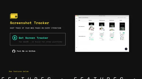 Screenshot Tracker Automate Web Page Screenshots Across Iterations
Screenshot Tracker streamlines the process of capturing and organizing web page screenshots, allowing users to monitor changes across different screen resolutions and development iterations.
- Free
-
4
 ClampGenerator Create fluid font sizes & layouts with precision
ClampGenerator provides specialized tools to generate responsive CSS clamp() values for fluid typography and layouts, eliminating manual calculations for designers and developers.
- Free
-
5
 PixelConverter Pixels conversion made easy!
PixelConverter is a free online tool that converts pixels to various units like cm, inches, em, and point, and resizes images and photos to any dimension.
- Free
-
6
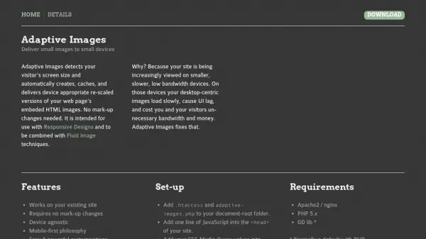 Adaptive Images Deliver optimized images by detecting device screen size automatically
Adaptive Images automatically detects screen size and delivers appropriately scaled images, ensuring fast loading and reduced bandwidth on all devices.
- Free
-
7
 Mockuper Free Online Mockups Generator for Devices
Mockuper is a free online tool for generating high-quality device mockups, including desktops, laptops, mobiles, tablets, and smartwatches, for presentation and design purposes.
- Free
-
8
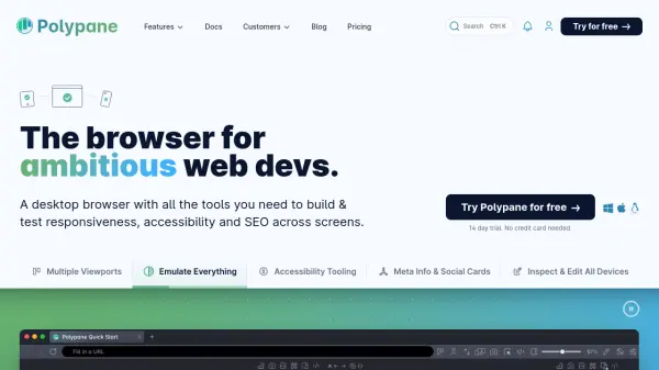 Polypane The browser for ambitious web developers.
Polypane is a desktop browser designed to help web developers, designers, and teams efficiently build, debug, and test website responsiveness, accessibility, and SEO across multiple devices and viewports.
- Paid
- From 19$
-
9
 InTab Visually style any website in any browser without typing CSS!
InTab is a browser extension that enables visual CSS editing and responsive design testing across 20+ virtual devices with one-click code export capabilities.
- Freemium
- From 4$
-
10
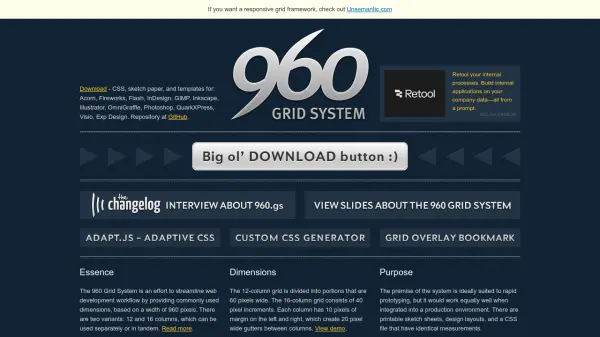 960 Grid System Streamline web development with a flexible 960-pixel grid framework
The 960 Grid System provides a CSS framework with 12, 16, and 24-column grid variants for rapid web prototyping and production, offering consistent dimensions and reusable templates.
- Free
-
11
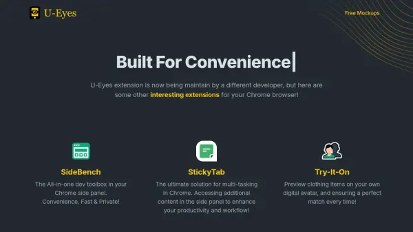 U-Eyes Mobile Device Simulator Chrome Extension for Responsive Testing and Preview
U-Eyes is a Chrome extension that simulates mobile devices for responsive website testing, offering screenshot and recording features to optimize mobile user experiences.
- Free
Didn't find tool you were looking for?