 ReddRadar
responsive web design tools - AI tools
-
 Screen Size Map Compare viewport sizes for responsive design planning
Screen Size Map is an AI-powered tool that compares viewport sizes in device-independent pixels to help designers and developers plan responsive layouts for websites and digital products, with data visualization based on worldwide screen usage statistics.
- Free
-
 Pixefy Streamline and Perfect Responsive Web Design Testing
Pixefy is a browser extension designed for effortless, comprehensive responsive website testing, allowing users to simulate multiple devices, inspect elements, and capture screenshots—all within a unified interface.
- Freemium
-
 Responsive Image Breakpoints Generator Easily generate the optimal responsive image dimensions
Responsive Image Breakpoints Generator is an AI-powered tool that automatically calculates optimal image sizes for responsive web design, helping developers create better viewing experiences across devices.
- Free
-
 ClampGenerator Create fluid font sizes & layouts with precision
ClampGenerator provides specialized tools to generate responsive CSS clamp() values for fluid typography and layouts, eliminating manual calculations for designers and developers.
- Free
-
 Pingendo Design, build and deploy web pages in a flow.
Pingendo is a modern desktop application for designing, building, and deploying responsive web pages using Bootstrap, featuring a visual builder with real-time code editing and one-click publishing.
- Freemium
- From 12$
-
 960 Grid System Streamline web development with a flexible 960-pixel grid framework
The 960 Grid System provides a CSS framework with 12, 16, and 24-column grid variants for rapid web prototyping and production, offering consistent dimensions and reusable templates.
- Free
-
 Cirrus Spend more time building and less time worrying about CSS.
Cirrus is a SCSS framework designed for rapid prototyping, offering beautiful pre-built components and utility classes to streamline web development.
- Free
-
 Adaptive Images Deliver optimized images by detecting device screen size automatically
Adaptive Images automatically detects screen size and delivers appropriately scaled images, ensuring fast loading and reduced bandwidth on all devices.
- Free
-
 InTab Visually style any website in any browser without typing CSS!
InTab is a browser extension that enables visual CSS editing and responsive design testing across 20+ virtual devices with one-click code export capabilities.
- Freemium
- From 4$
-
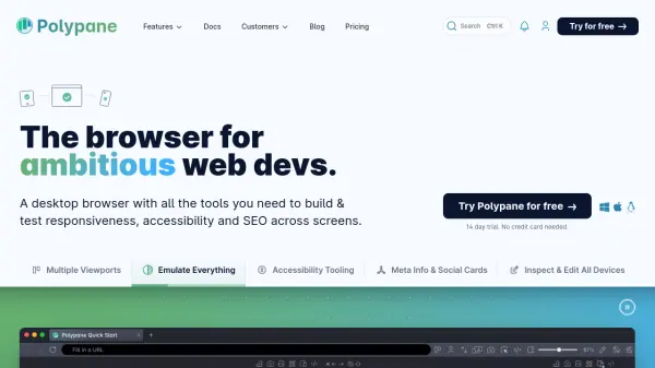 Polypane The browser for ambitious web developers.
Polypane is a desktop browser designed to help web developers, designers, and teams efficiently build, debug, and test website responsiveness, accessibility, and SEO across multiple devices and viewports.
- Paid
- From 19$
-
 Chris Henrick Front-End Web Developer & Design Engineer Portfolio
Chris Henrick is a front-end web developer and design engineer specializing in data visualization, web applications, UX prototyping, interaction design, and cartographic design.
- Other
-
 Yoga A portable layout engine targeting web standards
Yoga is an AI-powered portable layout engine that implements Flexbox for responsive web design across multiple platforms.
- Other
-
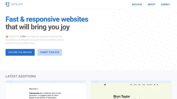 SITEJOY Fast & responsive websites that will bring you joy
SITEJOY is a curated archive of over 1,240 fast and responsive websites for developers and designers to explore for inspiration without compromising performance.
- Free
-
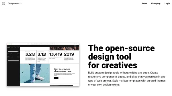 Components AI The open-source design tool for creatives
Components AI is a powerful design tool that enables creatives to build custom design tools, responsive components, and websites without coding. It offers visual design capabilities with parametric controls and multi-format export options.
- Freemium
- From 24$
-
 Rapidream Figma-to-React tool that gets it right for serious software development
Rapidream is an AI-powered Figma-to-React tool that converts designs into clean, responsive React code with intelligent element merging and automatic flex styling calculations.
- Contact for Pricing
-
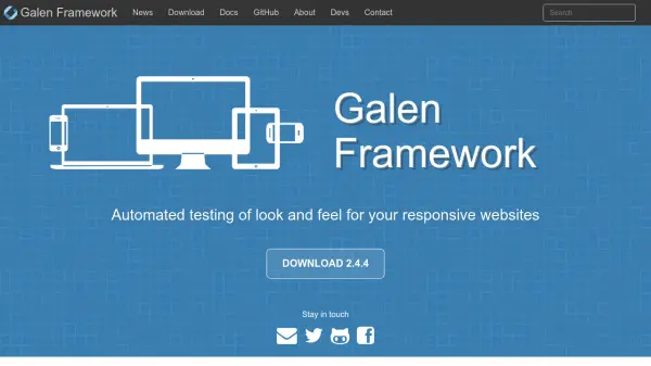 Galen Framework Automated testing of look and feel for your responsive websites
Galen Framework is an AI-powered automated testing tool for responsive web design, enabling developers to verify layout and visual elements across different screen sizes and browsers.
- Free
-
 U-Eyes Mobile Device Simulator Chrome Extension for Responsive Testing and Preview
U-Eyes is a Chrome extension that simulates mobile devices for responsive website testing, offering screenshot and recording features to optimize mobile user experiences.
- Free
-
 Milligram A minimalist CSS framework for fast and clean web design
Milligram is a lightweight CSS framework offering a minimal setup of styles to create fast and clean websites with only 2kb gzipped, designed for better performance and higher productivity.
- Free
-
 Angry Tools Free web tools to speed up your development
Angry Tools is a comprehensive collection of free online tools for web and Android development, offering CSS generators, image utilities, text converters, and layout builders to streamline development workflows.
- Free
-
 Pagedraw The best UI builder for the web
Pagedraw is an AI-powered UI builder that generates React components from visual designs, enabling developers to create high-quality code faster without manual CSS work.
- Freemium
-
 Cardinal Build more with less.
Cardinal is a modular, mobile-first CSS framework designed for performance and scalability, enabling front-end developers to prototype, build, and maintain responsive websites efficiently.
- Free
-
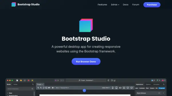 Bootstrap Studio Powerful desktop app for designing responsive Bootstrap websites visually.
Bootstrap Studio is a desktop website builder that enables users to create responsive, Bootstrap-based websites through intuitive drag-and-drop editing and advanced code tools.
- Pay Once
-
 Nextweb Professional Web Design Agency in Barcelona
Nextweb is a Barcelona-based web design agency specializing in creating unique, responsive websites with SEO optimization and ongoing maintenance support.
- Contact for Pricing
-
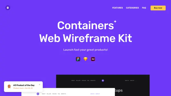 Containers Web Wireframe Kit Launch fast your great products!
Containers Web Wireframe Kit is a design system with 250+ blocks and 15 categories for creating web UX prototypes in Figma, Sketch, and Adobe XD, featuring dark/light versions and landing page templates.
- Pay Once
-
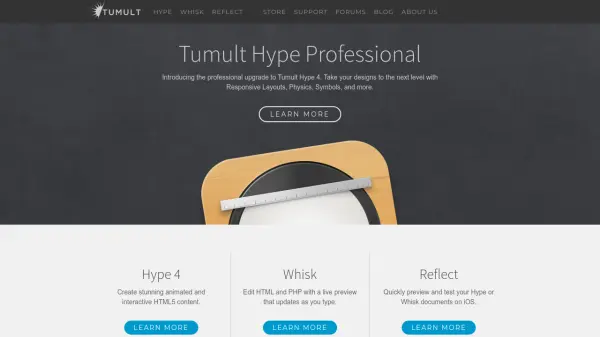 Tumult Hype Create stunning animated and interactive HTML5 content
Tumult Hype is a professional tool for creating animated and interactive HTML5 content, offering features like responsive layouts, physics, and symbols to enhance web design.
- Other
Featured Tools
Join Our Newsletter
Stay updated with the latest AI tools, news, and offers by subscribing to our weekly newsletter.
Explore More
-
AI training platform 34 tools
-
AI tattoo design tool 35 tools
-
AI for sports performance 15 tools
-
US bank statement processing tool 10 tools
-
OCR for invoices to Excel 10 tools
-
ai malware protection tool 25 tools
-
AI-ready data extraction tool 43 tools
-
AI customer data platform for businesses 46 tools
-
vocabulary enhancement tool for academics 22 tools
Didn't find tool you were looking for?