 ReddRadar
responsive layout development tool - AI tools
-
 Screen Size Map Compare viewport sizes for responsive design planning
Screen Size Map is an AI-powered tool that compares viewport sizes in device-independent pixels to help designers and developers plan responsive layouts for websites and digital products, with data visualization based on worldwide screen usage statistics.
- Free
-
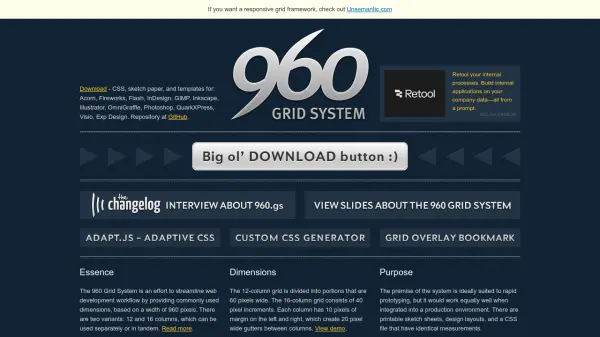 960 Grid System Streamline web development with a flexible 960-pixel grid framework
The 960 Grid System provides a CSS framework with 12, 16, and 24-column grid variants for rapid web prototyping and production, offering consistent dimensions and reusable templates.
- Free
-
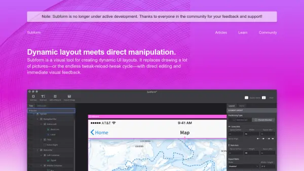 Subform Dynamic layout meets direct manipulation for UI design
Subform is a visual tool for creating dynamic UI layouts that replaces static design with direct editing and immediate feedback, enabling designers to work with real-world production constraints.
- Other
-
 Pixefy Streamline and Perfect Responsive Web Design Testing
Pixefy is a browser extension designed for effortless, comprehensive responsive website testing, allowing users to simulate multiple devices, inspect elements, and capture screenshots—all within a unified interface.
- Freemium
-
 Galen Framework Automated testing of look and feel for your responsive websites
Galen Framework is an AI-powered automated testing tool for responsive web design, enabling developers to verify layout and visual elements across different screen sizes and browsers.
- Free
-
 ClampGenerator Create fluid font sizes & layouts with precision
ClampGenerator provides specialized tools to generate responsive CSS clamp() values for fluid typography and layouts, eliminating manual calculations for designers and developers.
- Free
-
 Pingendo Design, build and deploy web pages in a flow.
Pingendo is a modern desktop application for designing, building, and deploying responsive web pages using Bootstrap, featuring a visual builder with real-time code editing and one-click publishing.
- Freemium
- From 12$
-
 Responsive Image Breakpoints Generator Easily generate the optimal responsive image dimensions
Responsive Image Breakpoints Generator is an AI-powered tool that automatically calculates optimal image sizes for responsive web design, helping developers create better viewing experiences across devices.
- Free
-
 Yoga A portable layout engine targeting web standards
Yoga is an AI-powered portable layout engine that implements Flexbox for responsive web design across multiple platforms.
- Other
-
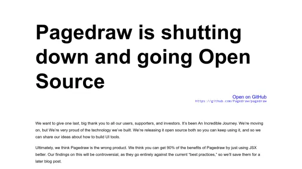 Pagedraw The best UI builder for the web
Pagedraw is an AI-powered UI builder that generates React components from visual designs, enabling developers to create high-quality code faster without manual CSS work.
- Freemium
-
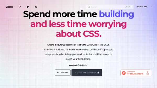 Cirrus Spend more time building and less time worrying about CSS.
Cirrus is a SCSS framework designed for rapid prototyping, offering beautiful pre-built components and utility classes to streamline web development.
- Free
-
 InTab Visually style any website in any browser without typing CSS!
InTab is a browser extension that enables visual CSS editing and responsive design testing across 20+ virtual devices with one-click code export capabilities.
- Freemium
- From 4$
-
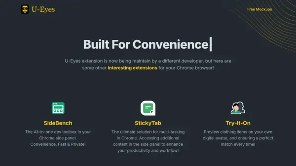 U-Eyes Mobile Device Simulator Chrome Extension for Responsive Testing and Preview
U-Eyes is a Chrome extension that simulates mobile devices for responsive website testing, offering screenshot and recording features to optimize mobile user experiences.
- Free
Featured Tools
Join Our Newsletter
Stay updated with the latest AI tools, news, and offers by subscribing to our weekly newsletter.
Explore More
-
AI training platform 34 tools
-
AI tattoo design tool 35 tools
-
AI for sports performance 15 tools
-
US bank statement processing tool 10 tools
-
OCR for invoices to Excel 10 tools
-
ai malware protection tool 25 tools
-
AI-ready data extraction tool 43 tools
-
AI customer data platform for businesses 46 tools
-
vocabulary enhancement tool for academics 22 tools
Didn't find tool you were looking for?